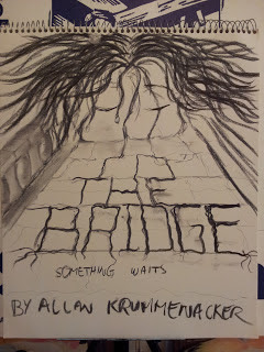
Designing Your Own Bookcover: Not As Easy As You Might Think - Part III
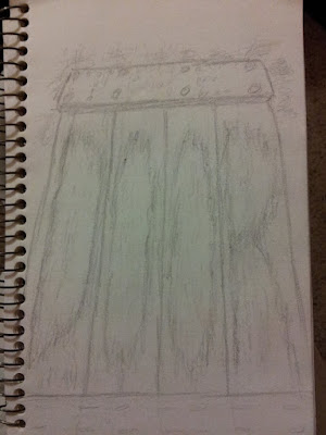
As usual I started experimenting with a basic quick sketch of what I had in mind. I knew right from the start that I wanted to incorporate the title into the image for this one, especially since it was our more traditional two word titles. Naturally I aimed for an actual door, knowing it would be fairly easy to incorporate the word "door" into the wood grain. From there I started testing out different color schemes for the wood grain itself. But then I started asking myself, how would a door that had been exposed to the elements for almost two centuries look? So I did some Googling, to find images to get a better idea of what such a door might look like. Here's a few of the examples I found: So now I had a basis to build upon. Yet I also felt that whatever I created should have good strong colors that still gave that weathered yet somewhat foreboding feel. So I pulled out my soft pastels and started laying d...