Designing Your Own Bookcover: Not As Easy As You Might Think - Part III
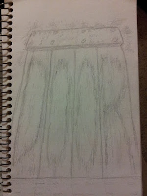
As usual I started experimenting with a basic quick sketch of what I had in mind. I knew right from the start that I wanted to incorporate the title into the image for this one, especially since it was our more traditional two word titles. Naturally I aimed for an actual door, knowing it would be fairly easy to incorporate the word "door" into the wood grain.
From there I started testing out different color schemes for the wood grain itself. But then I started asking myself, how would a door that had been exposed to the elements for almost two centuries look? So I did some Googling, to find images to get a better idea of what such a door might look like. Here's a few of the examples I found:
So now I had a basis to build upon. Yet I also felt that whatever I created should have good strong colors that still gave that weathered yet somewhat foreboding feel. So I pulled out my soft pastels and started laying down some colors in order to start forming the palette I would use in the actual piece. Of course I also incorporated lettering into the grain of the wood in order to help me build towards the full effect I was aiming for.
Dark, sinister, ancient-looking yet eye-catching. Satisfied that this was what I want to aim for in the final rendition, I set about putting down the first layers for the actual cover.
As things have progressed I added some stonework as well as ivy/vegetation to help add contrast as well as frame our sinister portal. I also experimented with some photo-shopped lettering to get an idea of what the final product might look like on the actual book.
And since the actual door was intended to open into a family crypt built into a hillside, I decided to get clever and incorporate the letters T. H. E. along with a date to represent the first of the Elliott family who passed through the door (still alive at the time) but never came out. In fact, his body was never found by those who came to investigate... mwahahahah.
Um... sorry about that. I'm supposed to be talking about book covers not promoting the story.
Anyway, using the initials this way I managed to get the words "The Door" clearly incorporated into the artwork, with room for our names. Though I may have to extend the bottom a bit more to keep within the restrictions about lettering getting too close to the edges.
Clearly the above image is not nearly finished. The door itself still needs to be more weathered, and the vegetation needs to be made to look more sinister and eerie. Plus the door itself could use a hand and a lock, don't you think? But you get the general idea from this and where it's headed.
So to clarify, if you set out to try and design your own book cover be prepared. You'll need to know the image requirements of whatever self-publishing company you're using. Test the image out on prospective readers, get feedback. You may also need to do some or as much research as you did for your manuscript for accurate details to incorporate into the cover. And of course, make it eye-catching, intriguing, and alluring. Remember your cover is part of that first introduction to the reader. give them something that makes them want to pick up your book and start leafing through it. Because you may have one of the best stories in town, but if the package doesn't promise what your story can deliver, it won't even get a second glance.
Until next time, take care and keep writing.


Comments
Post a Comment