Cover Art For Books: Choosing What's Right Not Only For You But Your Audience
You've just about finished writing your novel and can see the finish line coming up in the distance. But now you have a new concern to deal with, creating a cover for it. But what kind of art should you use? Should it be a photograph, cartoon, an image that evokes feelings from a favorite movie like having several people walking towards the reader like in "The Right Stuff"? Should it just show an individual who appears in the story, or should it show a scene that's right out of the book?
So many questions, right? And the answer is... I don't know. Every author has to choose their own path or vision for their work. It's not an easy thing to do either, I know this. All I can say is know your audience and what captures their imagination. Make sure the art speaks to them and makes them want to pick up your work.
But this can be difficult sometimes. Tastes in art changes over the years so I thought it might be fun to demonstrate how the style of covers can change over time using one of the legendary Ray Bradbury's most famous works, "Fahrenheit 451".
Here is the original cover when the novel first came out. Although somewhat cartoonish or simplistic, the image reflects the torment of the protagonist as he wrestles with his work as a 'fireman' who burns books for the good of society. A part of him feels the loss and flames as ideas and words are consumed by the fires he helps create.
Now here we have another cover that was created depicting "The Hound" from the novel. Although clearly the image depicts an animal at second glance we note the extra set of legs and are left wondering what part this creature plays in the novel. Unless you're familiar with the story, you'd never know there was a 'Hound' in the book, but it was a mechanical device used for locating and hunting down 'criminal' elements. Furthermore, it did not in the least look like an actual animal. So although this cover would definitely catch the eye and make you wonder, it doesn't really say a lot about the story itself. Again, keep in mind I'm speaking for myself in this entry, not any of you.
This next cover, obviously designed for the books 60th anniversary, is very simple but has good color and a clever image. Fusing a 'book of matches' and an actual 'book' is quite clever and assumes the potential reader has some inkling of the story inside.
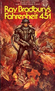
This next image is both eye-catching and disturbing. The artwork is something almost nightmarish to me, yet I can see how it works considering the society depicted in the story is rather warped and disturbing. I can even appreciate the strange 'hound' figure which in some ways might have looked even better on the cover of an HP Lovecraft book. And although effective, I'm not sure this would be a cover I'd want lying around when company comes over or if I had children.
The next cover obviously harkens back to the original design, but with more color and was possibly aimed more at young boys. Certainly it would catch a younger reader's eye and again it clearly hints at what can be found inside the pages.
I personally found the next cover very effective as we see an interpretation of what the fireman's gear might look like. Plus the reflection of the burning books in the visor again clearly helps the prospective reader get an idea of the storyline. Plus it keeps the red and yellow colors which hint at fire which is also seen quite frequently in a number of these covers.
In this final image we see a dramatic scene of our protagonist in the middle of a conflagration. We get a feeling of a fiery future and a clear sense of what a fireman does in that world.
Now as I said at the beginning of this entry, I'm speaking mostly for myself. Choosing the art for the cover of your book is entirely up to you. The content, the colors, the message your trying to get across is all on the writer. It's your baby, but it is also important to keep in mind how potential readers may react to that image so know your audiences tastes. Remember you want them to pick your book out of a sea of choices available to them, both online and in an brick and mortar store.
Also, keep in mind to not have the cover depict something that does not actually appear or happen in the book, because then the buyer is going to feel cheated. I've seen many books over the years where that happened and felt exactly that way. As good as the story might have been, I felt betrayed and had a bitter taste left in my mouth which made me gun-shy about picking up another work by that particular author.
I would suggest beta-testing your cover choices with your audience. Get feedback on that image just as you would on the story itself. Remember, that book cover is the handshake that introduces your work to potential readers. Entice them, pique their interest, but don't betray their trust. What is on that cover should show up somewhere in the book, whether it's a panoramic view of the world the story is taking place on, a moment of adventure, or an image of your heroes/villains. Play fair and get those readers to pick up your book and leave them wanting your next one.
Until next time, take care and keep writing.


Comments
Post a Comment